
Project detail
Nimble Gravity
Nimble Gravity
Nimble Gravity
Nimble Gravity is a global consulting firm specializing in data, AI, and digital engineering, helping organizations turn complex challenges into scalable, real-world solutions. I joined as a UI/UX intern and, over the course of a year, moved into an Associate role, working across internal tools and client-facing products where the common thread was the same: taking something genuinely complex and making it usable by people who aren't experts in it.
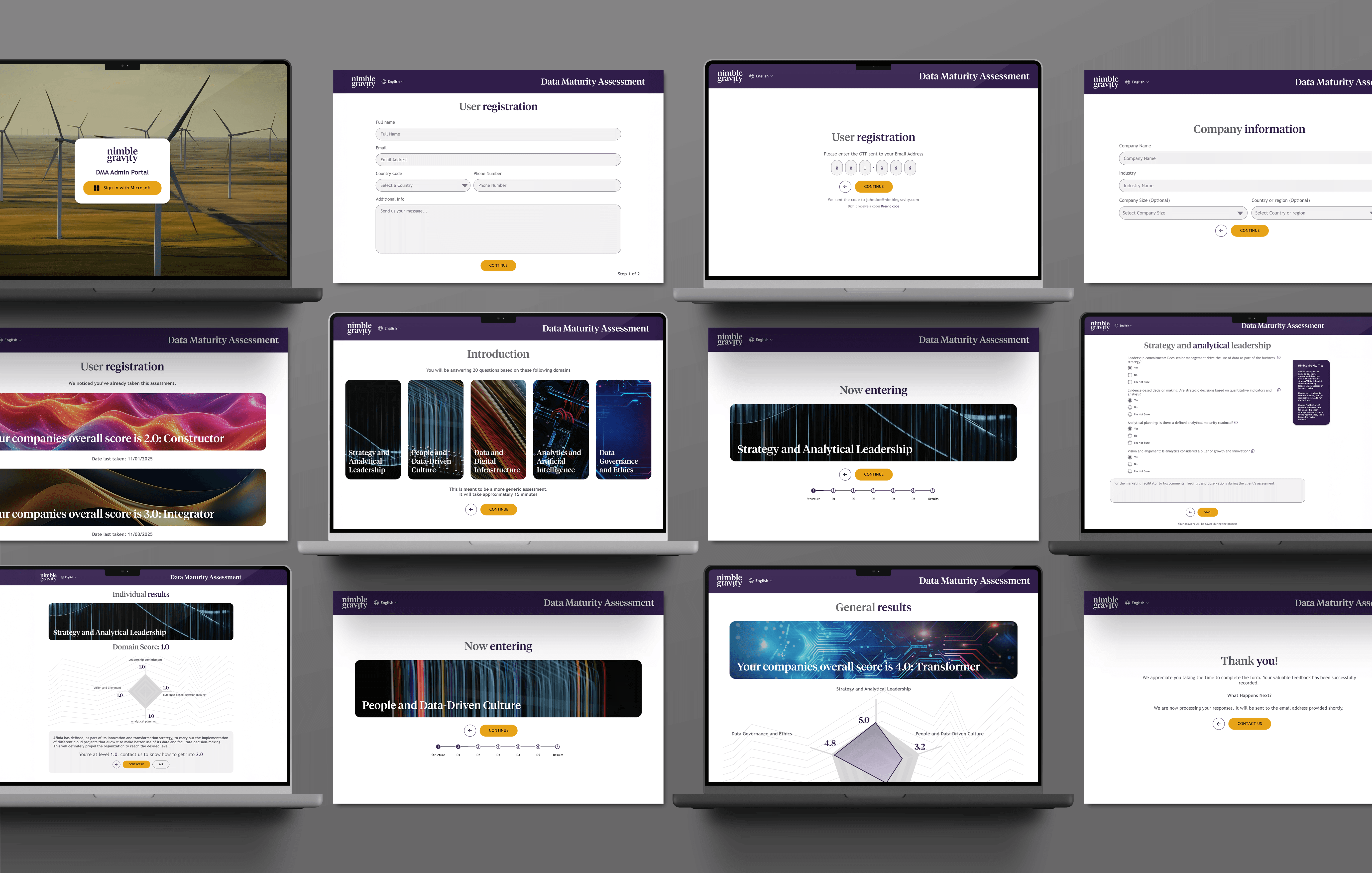
Turning a consulting framework into a 15-minute self-assessment
A data maturity framework is useful to a consultant. It's meaningless to the prospect filling it out, unless the design does the translating.
Nimble Gravity uses a Data Maturity Assessment to help prospective clients understand where their own data practices actually stand, across five domains, before any sales conversation happens. Building it meant working closely with product managers and engineers, but as the UX designer on it, the challenge that fell to me wasn't the scoring logic; it was getting a busy executive to actually finish the thing, and then making the result feel like real insight instead of a spreadsheet of numbers. We simplified an originally industry-specific assessment down to 20 universal questions, added a "not sure" option so no one was forced to guess, and built in save-and-resume so a 15-minute assessment interrupted by a meeting doesn't force someone to start over.
The results needed the same care. Instead of just showing five numbers, the results screen leads with a radar chart across all domains, an overall score, and a level label with imagery, so someone understands where they stand in seconds. Scrolling down reveals each domain's color-coded score, its questions and answers, and a set of generated recommendations, with a direct hook at both the top and bottom of the page: you're at Level X, here's what it takes to reach Level X+1.
Turning a consulting framework into a 15-minute self-assessment
A data maturity framework is useful to a consultant. It's meaningless to the prospect filling it out, unless the design does the translating.
Nimble Gravity uses a Data Maturity Assessment to help prospective clients understand where their own data practices actually stand, across five domains, before any sales conversation happens. Building it meant working closely with product managers and engineers, but as the UX designer on it, the challenge that fell to me wasn't the scoring logic; it was getting a busy executive to actually finish the thing, and then making the result feel like real insight instead of a spreadsheet of numbers. We simplified an originally industry-specific assessment down to 20 universal questions, added a "not sure" option so no one was forced to guess, and built in save-and-resume so a 15-minute assessment interrupted by a meeting doesn't force someone to start over.
The results needed the same care. Instead of just showing five numbers, the results screen leads with a radar chart across all domains, an overall score, and a level label with imagery, so someone understands where they stand in seconds. Scrolling down reveals each domain's color-coded score, its questions and answers, and a set of generated recommendations, with a direct hook at both the top and bottom of the page: you're at Level X, here's what it takes to reach Level X+1.
Rebuilding FXA Adult Sports from the ground up
The site's problems went well beyond looking dated.
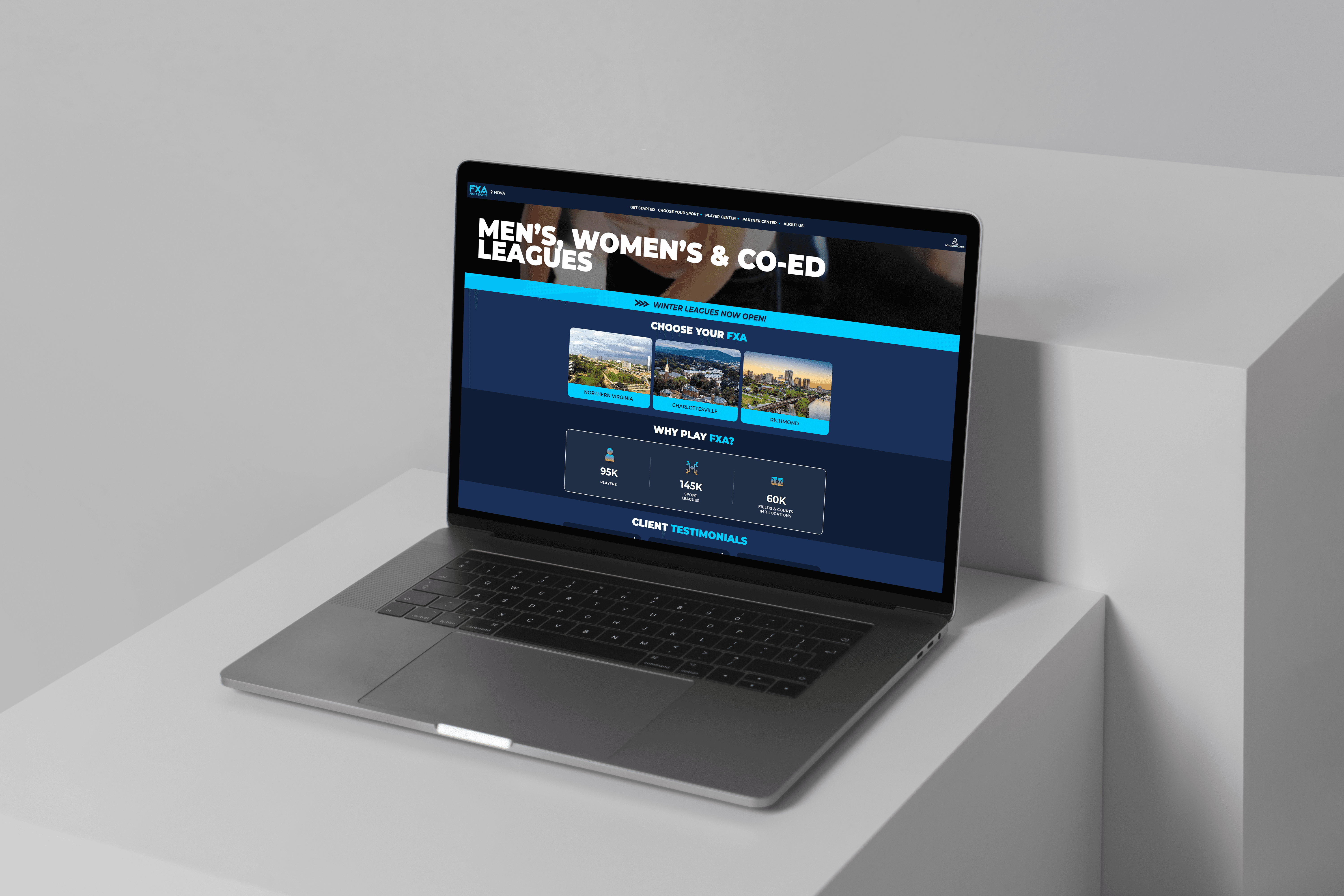
FXA Adult Sports is the largest adult sports league in the greater Virginia area, and their site had real usability problems: outdated pages, navigation that made it hard to find or register for a league, and friction in the signup flow itself. This wasn't a cosmetic refresh; it was a full redesign done over months of back-and-forth with multiple executive-level stakeholders, each with their own opinion on what the site needed to be.
The work covered new pages built from scratch, a rebuild of the existing ones, a reworked navigation bar, and a signup and registration flow redesigned specifically for the mobile use case, since most people finding a league and signing up were doing it from their phone, not a desktop. This was a team effort with product and engineering throughout, with my role focused on the user experience and interface decisions across all of it.
Rebuilding FXA Adult Sports from the ground up
The site's problems went well beyond looking dated.
FXA Adult Sports is the largest adult sports league in the greater Virginia area, and their site had real usability problems: outdated pages, navigation that made it hard to find or register for a league, and friction in the signup flow itself. This wasn't a cosmetic refresh; it was a full redesign done over months of back-and-forth with multiple executive-level stakeholders, each with their own opinion on what the site needed to be.
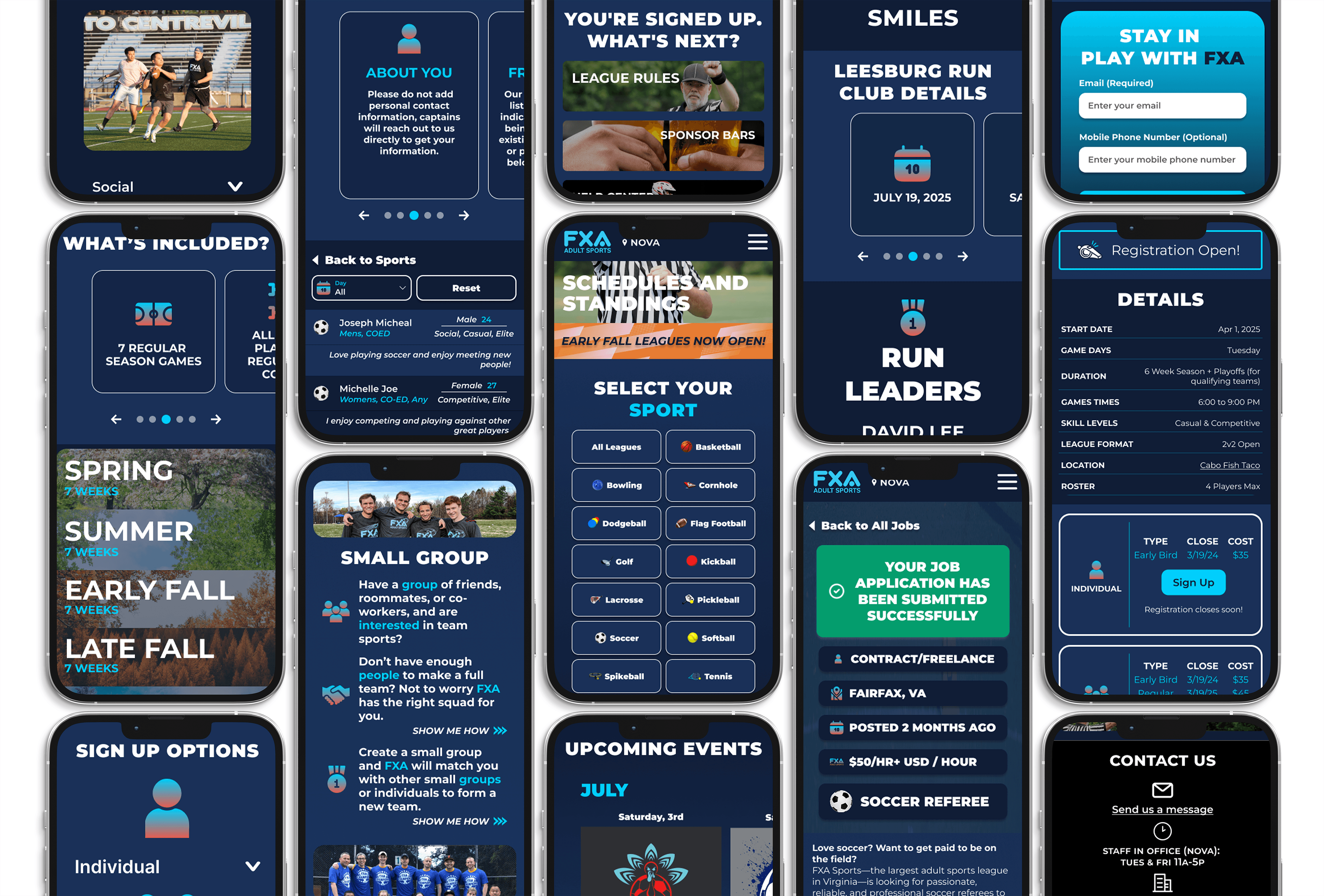
The work covered new pages built from scratch, a rebuild of the existing ones, a reworked navigation bar, and a signup and registration flow redesigned specifically for the mobile use case, since most people finding a league and signing up were doing it from their phone, not a desktop. This was a team effort with product and engineering throughout, with my role focused on the user experience and interface decisions across all of it.
Designing at a different scale
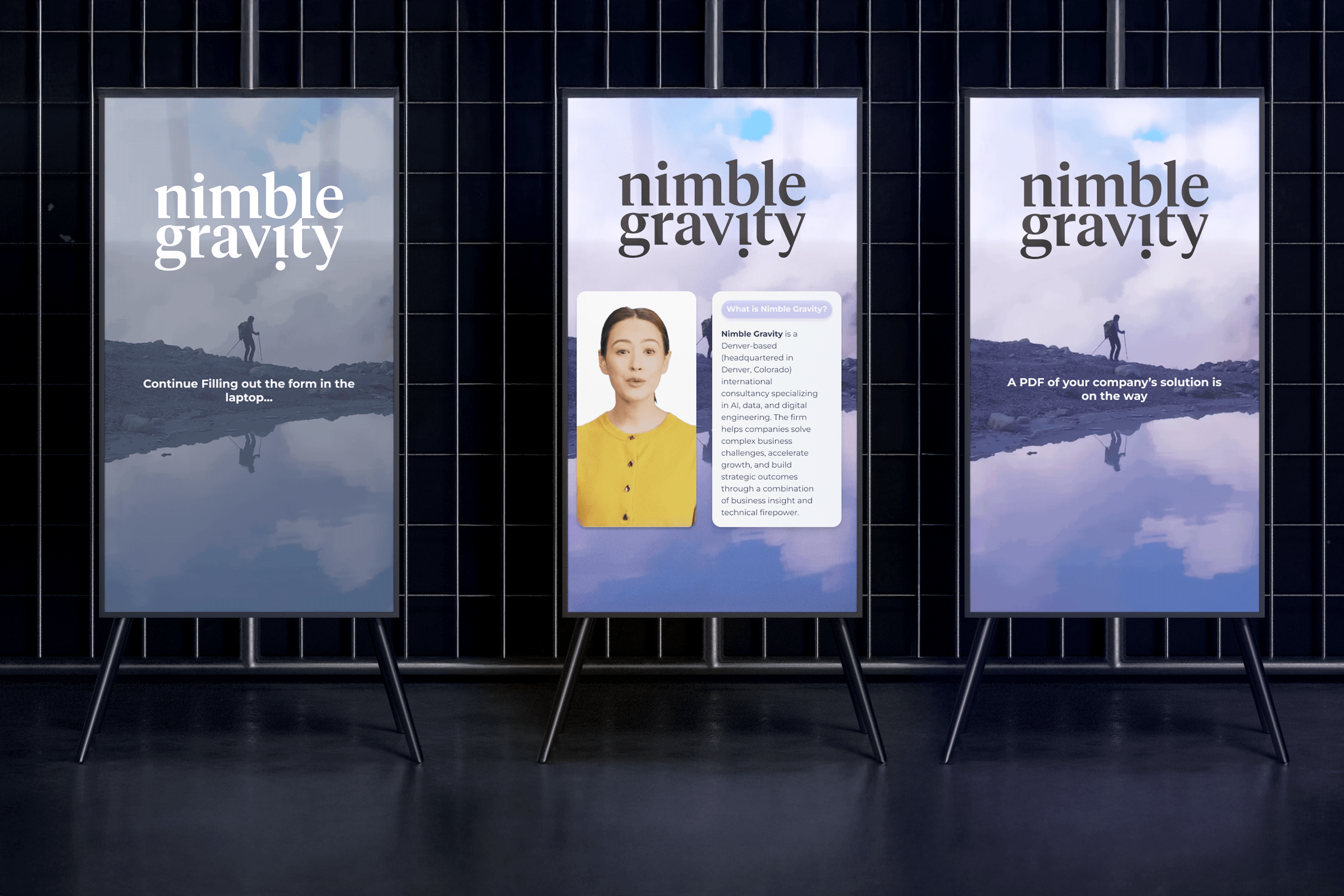
Not every project at Nimble Gravity lived on a screen someone scrolls through alone. I also designed a large-format, avatar-led experience showcased at a Microsoft event, built for someone with no instructions and about thirty seconds of attention in a live room, a very different design problem from either FXA or the assessment, and a reminder that "usable" doesn't mean the same thing on every surface.
Designing at a different scale
Not every project at Nimble Gravity lived on a screen someone scrolls through alone. I also designed a large-format, avatar-led experience showcased at a Microsoft event, built for someone with no instructions and about thirty seconds of attention in a live room, a very different design problem from either FXA or the assessment, and a reminder that "usable" doesn't mean the same thing on every surface.
Outcome
FXA Adult Sports shipped a full redesign that stakeholders across the organization signed off on. The Data Maturity Assessment now completes in about 15 minutes, protects itself against dropout with save-and-resume, and turns a technical framework into a result a non-technical prospect can actually understand and act on. A year into the internship, that body of work became the basis for moving into a full Associate role.
What these projects actually tested: Whether I could take something dense (a scoring framework, a legacy site) and find the specific place where a normal person would get confused or give up, then design that friction away without ever needing to explain the underlying complexity to them.
Outcome
FXA Adult Sports shipped a full redesign that stakeholders across the organization signed off on. The Data Maturity Assessment now completes in about 15 minutes, protects itself against dropout with save-and-resume, and turns a technical framework into a result a non-technical prospect can actually understand and act on. A year into the internship, that body of work became the basis for moving into a full Associate role.
What these projects actually tested: Whether I could take something dense (a scoring framework, a legacy site) and find the specific place where a normal person would get confused or give up, then design that friction away without ever needing to explain the underlying complexity to them.
View Other Projects
View Other Projects

Contact
Let's Get in Touch
Contact
Let's Get in Touch
Contact