
Project detail
NewToCulture
NewToCulture
NewToCulture
NewToCulture is an independent apparel brand built around tote bags as a canvas for cultural storytelling and a real business, with over 2,000 sales on Etsy. I was hired to build the brand's full identity and translate it into a digital presence, working from a problem statement the founder had already thought through carefully.
Designing for a gap the founder had already found
Most brands treat cultural identity as an aesthetic to borrow from. The founder wanted to build one around it instead.
The founder's starting brief was direct: mainstream fashion tends to chase broad appeal over personal meaning, and the brands that do reach for cultural themes often do it in ways that read as commercialized or appropriative rather than genuine. That left an actual gap: people who wanted to express their heritage through what they wore, without it feeling like a costume or a marketing angle. My job was to give that idea a visual identity that felt intentional rather than decorative.
A quick look at the actual competitive landscape confirmed the gap was real. Other Etsy tote sellers like Lefia Tee and byOctober, along with bigger players like Strand Books and Out of Print, were fully generic: literary or novelty prints with no cultural specificity at all. Nobody in that space was building a brand actually rooted in identity and representation, which meant NewToCulture didn't need to fight for attention inside an existing niche; it needed to define one.
Designing for a gap the founder had already found
Most brands treat cultural identity as an aesthetic to borrow from. The founder wanted to build one around it instead.
The founder's starting brief was direct: mainstream fashion tends to chase broad appeal over personal meaning, and the brands that do reach for cultural themes often do it in ways that read as commercialized or appropriative rather than genuine. That left an actual gap: people who wanted to express their heritage through what they wore, without it feeling like a costume or a marketing angle. My job was to give that idea a visual identity that felt intentional rather than decorative.
A quick look at the actual competitive landscape confirmed the gap was real. Other Etsy tote sellers like Lefia Tee and byOctober, along with bigger players like Strand Books and Out of Print, were fully generic: literary or novelty prints with no cultural specificity at all. Nobody in that space was building a brand actually rooted in identity and representation, which meant NewToCulture didn't need to fight for attention inside an existing niche; it needed to define one.
Building a system, not just a mark
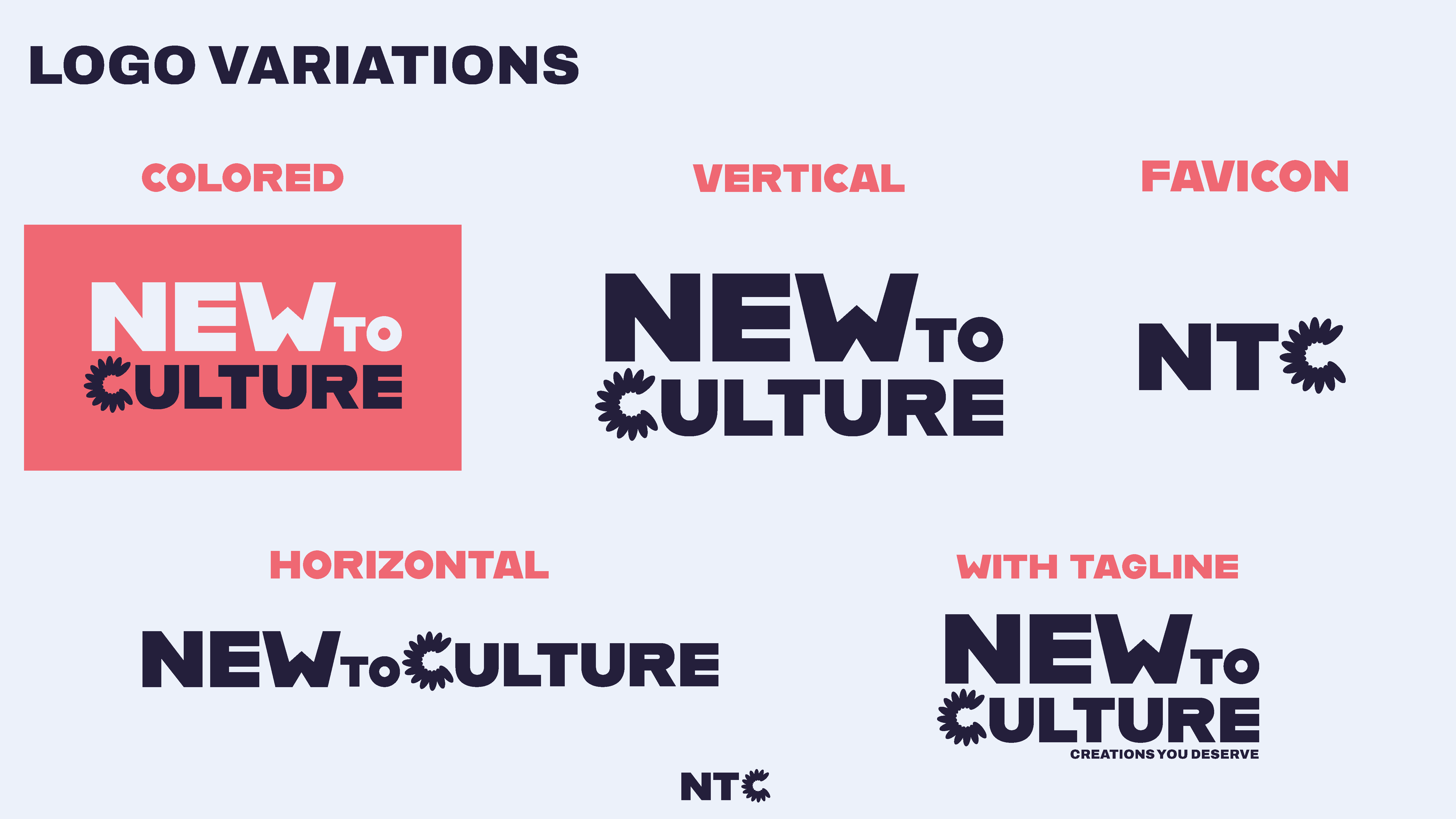
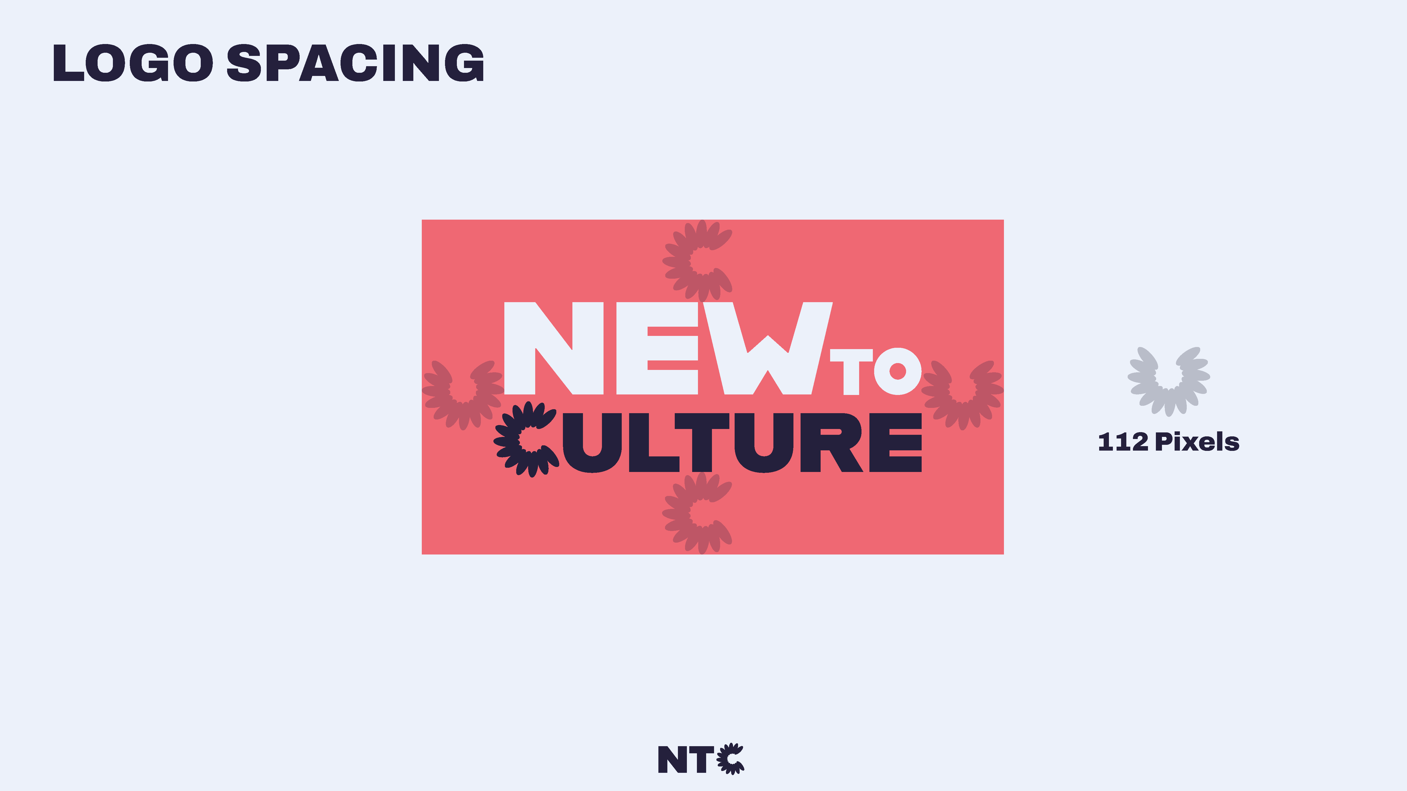
The identity needed to hold up across more than one format, even without a physical product constraint to design around, since everything here lives digitally, on Etsy listings, social presence, and the site itself. That meant building out real variations, colored and single-color, horizontal and vertical, a standalone icon, and a version with the tagline, plus defined spacing rules, so the mark stays legible and consistent no matter where it's placed rather than getting stretched or cropped inconsistently across different formats.
Carrying the identity into the site
The website extended that same identity into a shopping experience built around storytelling rather than a plain product grid, treating each tote as something connected to culture and lifestyle rather than just merchandise. Clean navigation and strong product imagery did the commercial work, while the brand voice established in the identity system carried through in tone and layout, so the site read as an extension of the mission rather than a separate marketing layer bolted onto it.
Building a system, not just a mark
The identity needed to hold up across more than one format, even without a physical product constraint to design around, since everything here lives digitally, on Etsy listings, social presence, and the site itself. That meant building out real variations, colored and single-color, horizontal and vertical, a standalone icon, and a version with the tagline, plus defined spacing rules, so the mark stays legible and consistent no matter where it's placed rather than getting stretched or cropped inconsistently across different formats.
Carrying the identity into the site
The website extended that same identity into a shopping experience built around storytelling rather than a plain product grid, treating each tote as something connected to culture and lifestyle rather than just merchandise. Clean navigation and strong product imagery did the commercial work, while the brand voice established in the identity system carried through in tone and layout, so the site read as an extension of the mission rather than a separate marketing layer bolted onto it.

Outcome
A full brand system, logo, color palette, typography, and a website design, built from a founder's own clearly defined mission and grounded in real competitive research rather than assumption.
What this project actually tested: A brand identity needed to carry a specific, personal mission (representation without appropriation) through every touchpoint, from a single wordmark down to how a product page actually reads, without the message getting diluted along the way.
Outcome
A full brand system, logo, color palette, typography, and a website design, built from a founder's own clearly defined mission and grounded in real competitive research rather than assumption.
What this project actually tested: A brand identity needed to carry a specific, personal mission (representation without appropriation) through every touchpoint, from a single wordmark down to how a product page actually reads, without the message getting diluted along the way.
View Other Projects
View Other Projects

Contact
Let's Get in Touch
Contact
Let's Get in Touch
Contact