
Project detail
Access Mode
Access Mode
Access Mode
Access Mode is a nonprofit accelerator closing opportunity gaps for underrepresented tech founders, connecting them to mentorship, capital, and community. Every asset I designed had to carry that mission, not just look good. As the Marketing Intern, I worked closely with the marketing coordinator (now Chief of Staff) to keep each piece intentional and deliberately away from generic, corporate-startup visual language.
Graphic Design
3 Months
Designing for a room that's already sophisticated
The challenge wasn't looking polished enough; it was staying distinct in a space full of polished, forgettable startup branding.
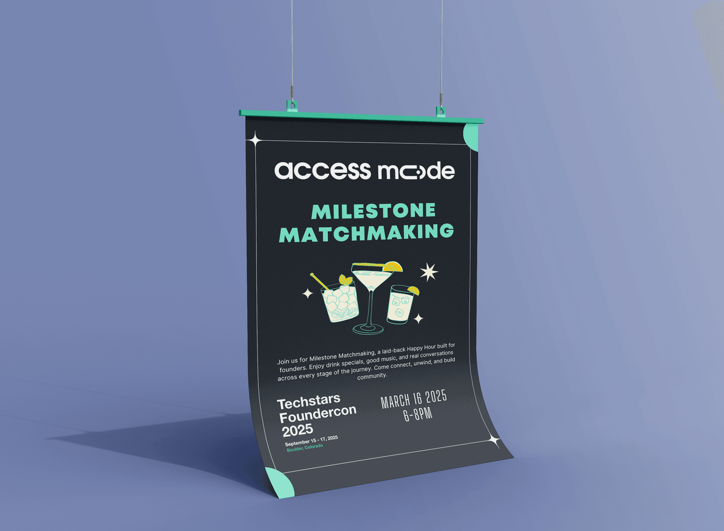
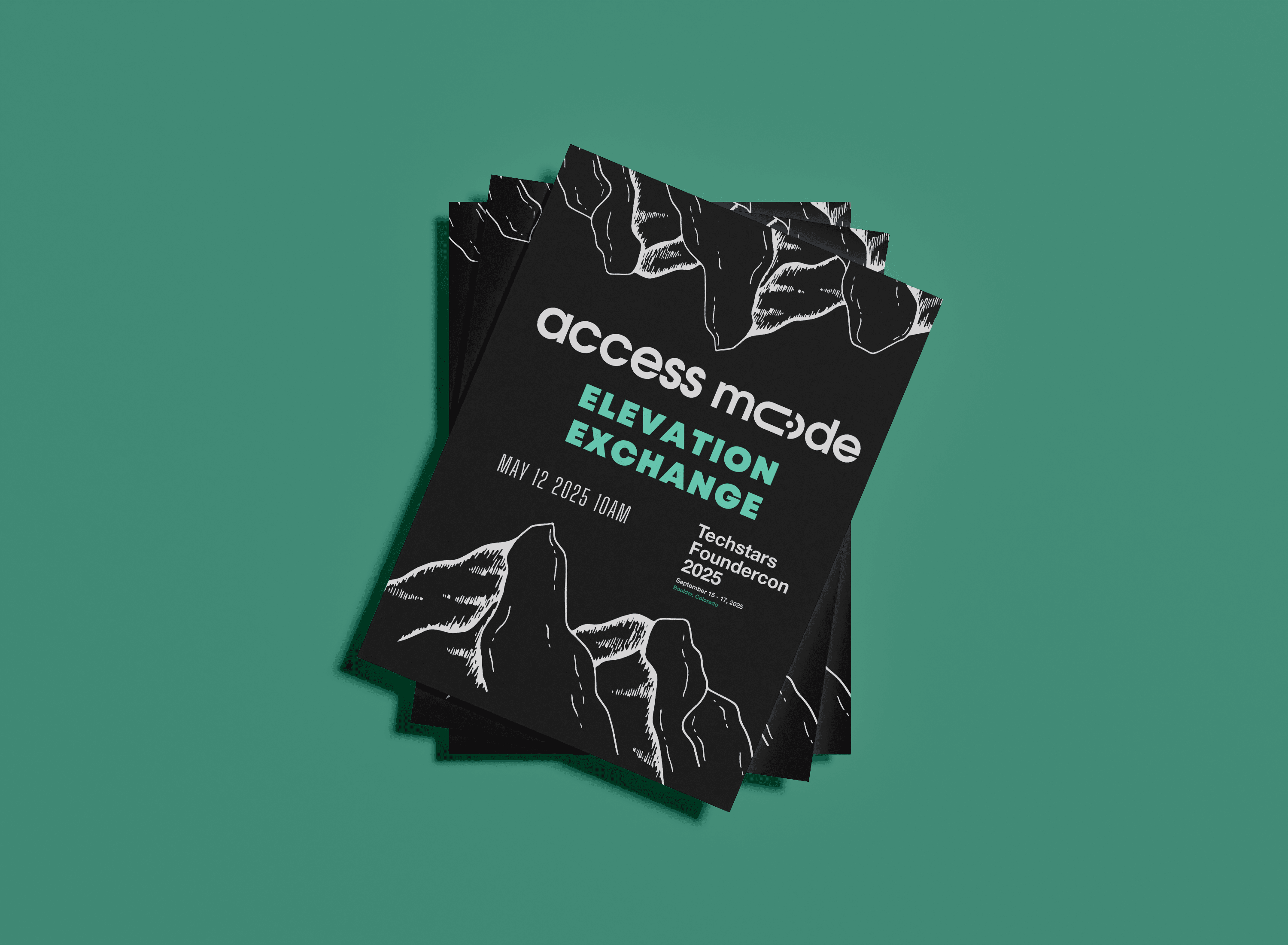
Milestone Matchmaking and Elevation Exchange were both built for Techstars Foundercon, connecting founders with mentors, peers, and investors. Because Access Mode is already well integrated into the startup ecosystem, there was no pressure to prove legitimacy through a safe, corporate look. That freedom came with its own challenge: staying visually distinct and intentional in a space where most event collateral blurs together into the same startup-conference aesthetic.
Designing for a room that's already sophisticated
The challenge wasn't looking polished enough; it was staying distinct in a space full of polished, forgettable startup branding.
Milestone Matchmaking and Elevation Exchange were both built for Techstars Foundercon, connecting founders with mentors, peers, and investors. Because Access Mode is already well integrated into the startup ecosystem, there was no pressure to prove legitimacy through a safe, corporate look. That freedom came with its own challenge: staying visually distinct and intentional in a space where most event collateral blurs together into the same startup-conference aesthetic.
Finding the tone for an idea that had none yet
A workshop literally called "Build a Breakup" needed a poster that felt playful without losing the information underneath it.
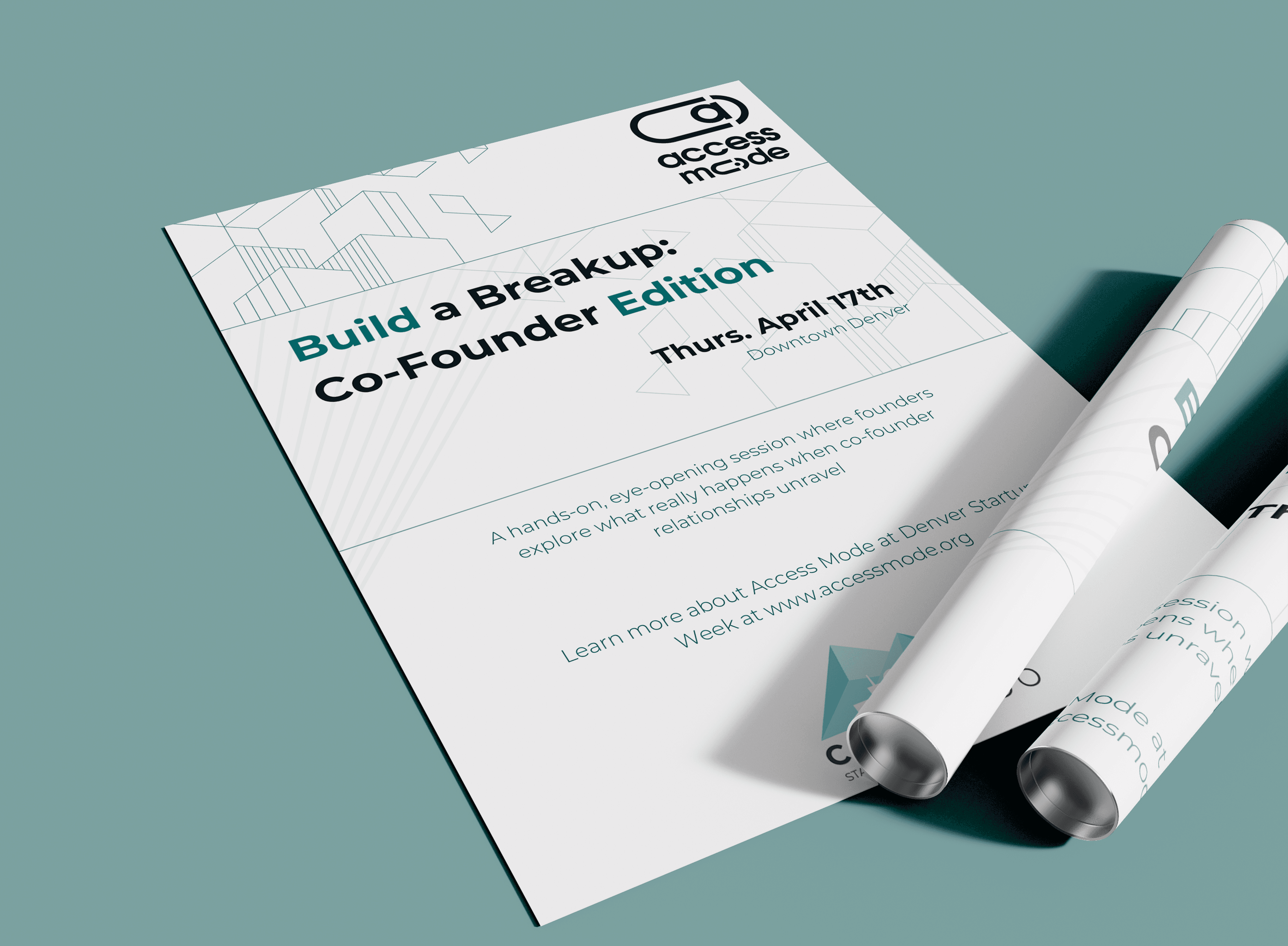
This was the hardest piece to solve, mostly because there was no existing visual language to borrow from. The event used a breakup metaphor to talk about co-founder dynamics and startup readiness, which meant the flyer needed to read as playful and inviting, while still clearly communicating what the workshop actually was, since a joke that obscures the event's purpose isn't a good flyer. It took multiple rounds of back and forth with the marketing coordinator before landing on the version that balanced both.
A completely different audience
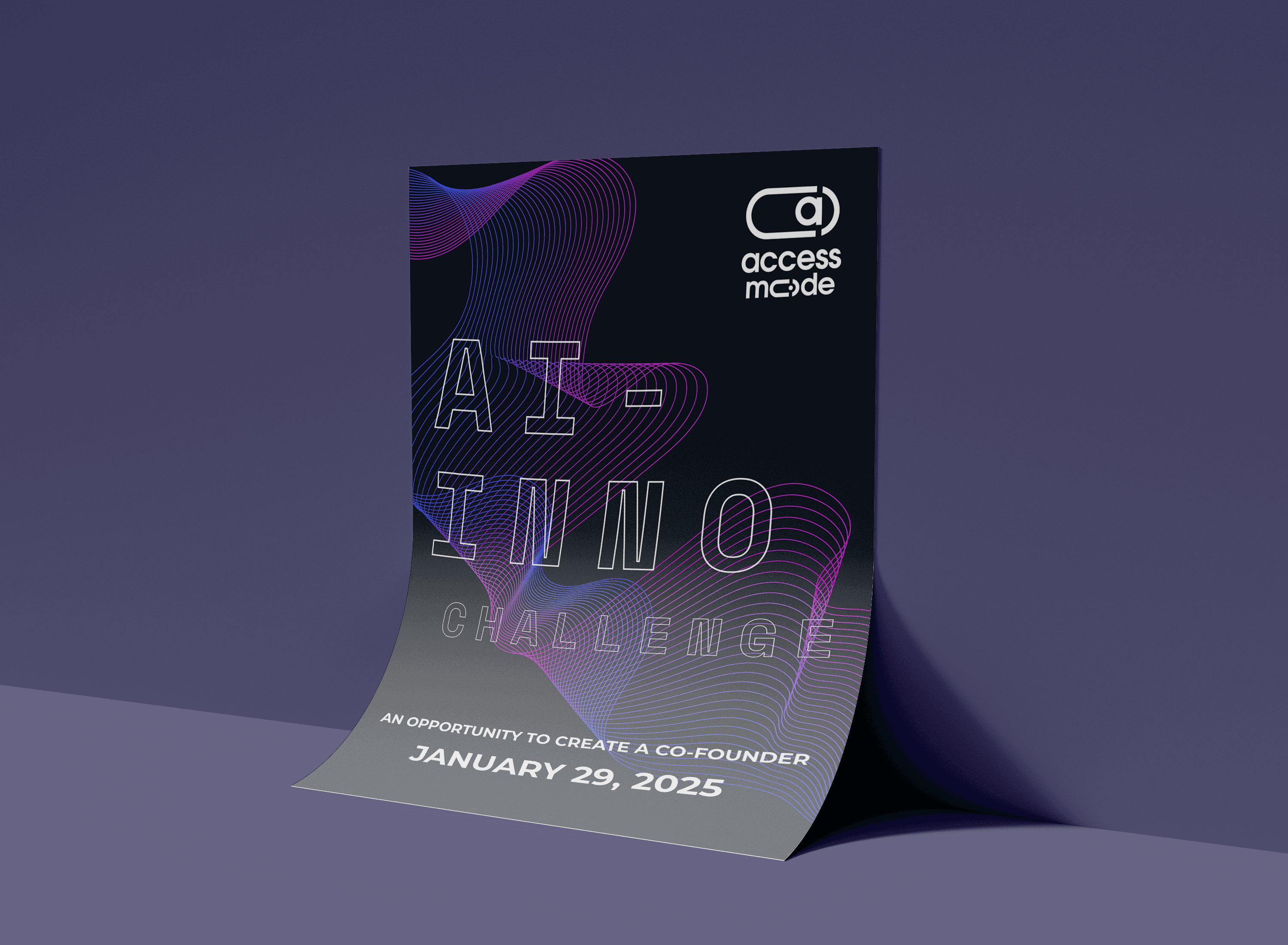
The AI Innovation Challenge flyer was built for Denver high schoolers interested in AI and tech, a genuinely different audience from founders and investors, and one that needed its own tone rather than a scaled-down version of the other pieces. Where the Techstars flyers could lean on a shared cultural fluency with the startup world, this one had to make an unfamiliar, technical topic feel approachable and exciting to teenagers who might not see themselves in tech yet. That meant a more energetic, direct visual approach, built to grab attention fast rather than assume any existing interest.
Finding the tone for an idea that had none yet
A workshop literally called "Build a Breakup" needed a poster that felt playful without losing the information underneath it.
This was the hardest piece to solve, mostly because there was no existing visual language to borrow from. The event used a breakup metaphor to talk about co-founder dynamics and startup readiness, which meant the flyer needed to read as playful and inviting, while still clearly communicating what the workshop actually was, since a joke that obscures the event's purpose isn't a good flyer. It took multiple rounds of back and forth with the marketing coordinator before landing on the version that balanced both.
A completely different audience
The AI Innovation Challenge flyer was built for Denver high schoolers interested in AI and tech, a genuinely different audience from founders and investors, and one that needed its own tone rather than a scaled-down version of the other pieces. Where the Techstars flyers could lean on a shared cultural fluency with the startup world, this one had to make an unfamiliar, technical topic feel approachable and exciting to teenagers who might not see themselves in tech yet. That meant a more energetic, direct visual approach, built to grab attention fast rather than assume any existing interest.
Outcome
Four flyers, three distinct audiences, and one brand voice that never defaulted to generic startup visual language, all developed in close collaboration with Access Mode's marketing team.
What these projects actually tested: A consistent design intuition needed to hold up across a founder-and-investor audience, a general startup community, and a room full of high schoolers, without any of them feeling like an afterthought.
Outcome
Four flyers, three distinct audiences, and one brand voice that never defaulted to generic startup visual language, all developed in close collaboration with Access Mode's marketing team.
What these projects actually tested: A consistent design intuition needed to hold up across a founder-and-investor audience, a general startup community, and a room full of high schoolers, without any of them feeling like an afterthought.
View Other Projects
View Other Projects

Contact
Let's Get in Touch
Contact
Let's Get in Touch
Contact