
Project detail
CU Denver Wellness Center
CU Denver Wellness Center
CU Denver Wellness Center
The University of Colorado Denver Wellness Center runs fitness classes, mental health workshops, and awareness campaigns for the whole campus. My job was to give that work a visible, consistent presence everywhere a student might encounter it: on the website, on hallway posters, and across social media, each with its own format and its own audience attention span.

Redesigning on unfamiliar software
The real test wasn't creative freedom, but learning a new CMS on the fly while still keeping the design intentional.
The website redesign meant working inside Sitefinity, a CMS I hadn't used before, to rebuild core pages so they actually reflected the Wellness Center's programs instead of sitting on outdated templates. That meant thinking in terms of the blocks and layout options the platform actually offered, then figuring out how to make those real limits still produce something that felt considered on both desktop and mobile.
Redesigning on unfamiliar software
The real test wasn't creative freedom, but learning a new CMS on the fly while still keeping the design intentional.
The website redesign meant working inside Sitefinity, a CMS I hadn't used before, to rebuild core pages so they actually reflected the Wellness Center's programs instead of sitting on outdated templates. That meant thinking in terms of the blocks and layout options the platform actually offered, then figuring out how to make those real limits still produce something that felt considered on both desktop and mobile.
Building the system, not just the posts
A single post has to stop a scroll on its own, but it also has to sit next to every other post and still look like the same account.
Rather than design each post from scratch, I built the template system itself: the typography, the skyline motif, the color and logo treatment. That template is still what the account runs on today, so the actual design decision wasn't any single post; it was the set of rules that made every future post consistent without needing me in the room.


Building the system, not just the posts
A single post has to stop a scroll on its own, but it also has to sit next to every other post and still look like the same account.
Rather than design each post from scratch, I built the template system itself: the typography, the skyline motif, the color and logo treatment. That template is still what the account runs on today, so the actual design decision wasn't any single post; it was the set of rules that made every future post consistent without needing me in the room.
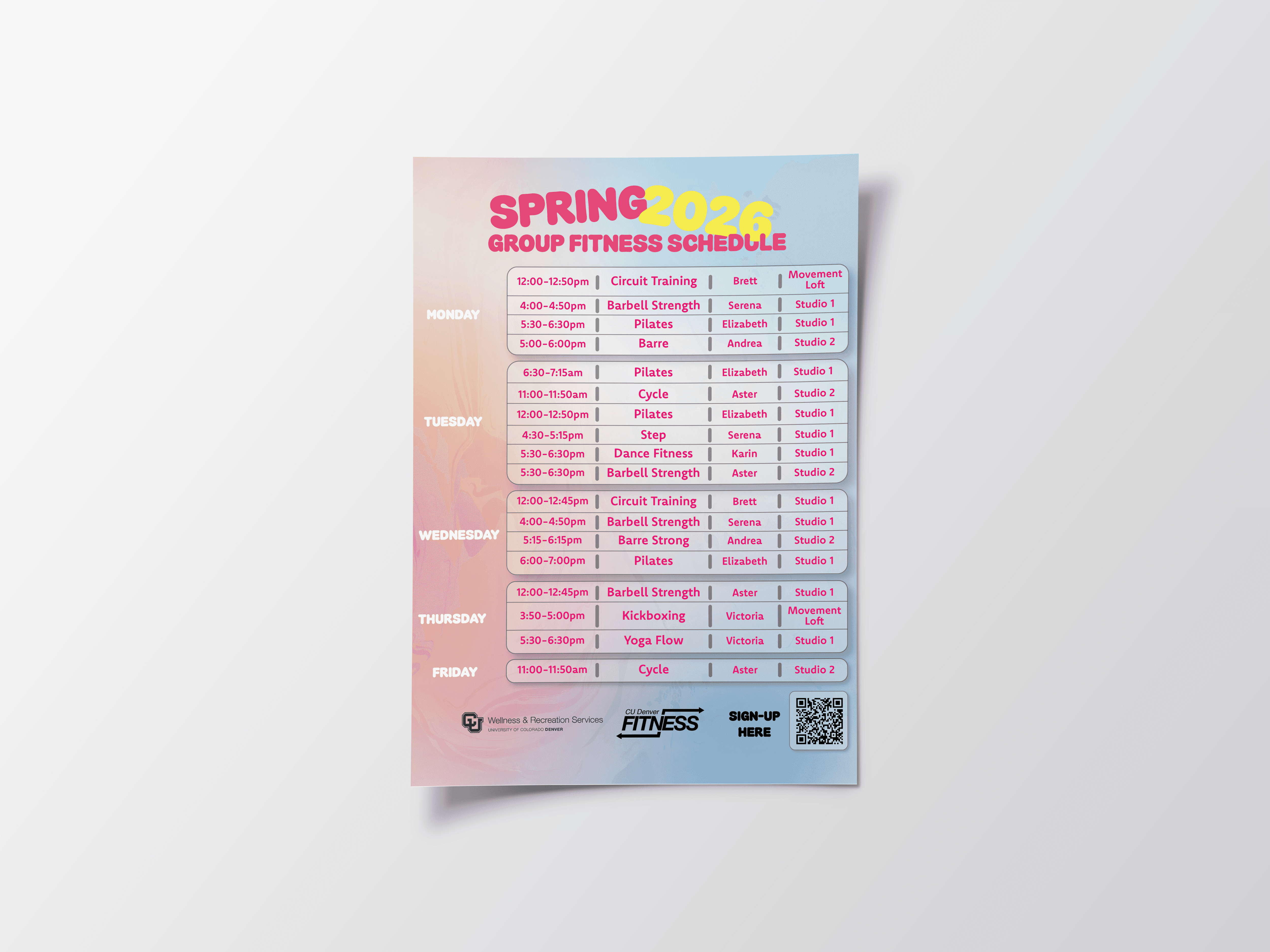

Two posters, two completely different jobs
A poster gets seen once, usually from a distance, so every one has to pass its own three-second test.
A group fitness schedule needs to be scannable at a glance from across a room, with a QR code built in for anyone ready to sign up on the spot. A sensitive campaign like International Overdose Awareness Day needs something else entirely: it has to read as urgent and informative without ever feeling clinical or alarmist.
Two posters, two completely different jobs
A poster gets seen once, usually from a distance, so every one has to pass its own three-second test.
A group fitness schedule needs to be scannable at a glance from across a room, with a QR code built in for anyone ready to sign up on the spot. A sensitive campaign like International Overdose Awareness Day needs something else entirely: it has to read as urgent and informative without ever feeling clinical or alarmist.
Outcome
The redesigned site pages, the poster series, and the Instagram content all shipped across the Wellness Center's physical spaces and digital channels, giving programs that used to rely on word-of-mouth an actual, consistent visual presence everywhere a student might look.
What these projects actually tested: Not one big creative swing, but whether I could move between a CMS I'd never touched, a stack of print deliverables, and a social feed with its own scroll-and-grid logic, and still keep everything feeling like it came from the same place.
Outcome
The redesigned site pages, the poster series, and the Instagram content all shipped across the Wellness Center's physical spaces and digital channels, giving programs that used to rely on word-of-mouth an actual, consistent visual presence everywhere a student might look.
What these projects actually tested: Not one big creative swing, but whether I could move between a CMS I'd never touched, a stack of print deliverables, and a social feed with its own scroll-and-grid logic, and still keep everything feeling like it came from the same place.
View Other Projects
View Other Projects

Contact
Let's Get in Touch
Contact
Let's Get in Touch
Contact